JOOL Health UI/UX Internship
Case Study
Getting to the heart of what drives people toward purpose
At a Glance
The Pursuit
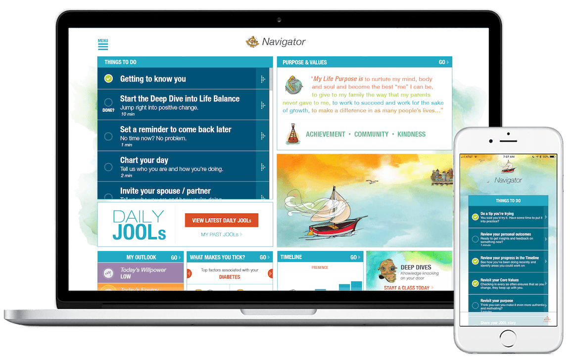
JOOL Health is a startup whose app focuses on helping users live a more well-rounded life. JOOL realized that their app couldn’t do that if users stopped engaging with the platform. My mission was to find out what made their user base tick, why they loved the platform, and what they needed to change about it.
The Result
I spent several months getting comfortable in the shoes of JOOL’s users. From a great deal of stakeholder engagement, user interviews, user testing, and ethnographic observation I was able to derive several recommendations for changes to the JOOL platform.
The Impact
After my departure JOOL released a version three of their application that included in their new designs the essence of the recommendations I made to the company after my research had concluded. They reduced the number of areas that users have to focus on improving in order to successfully use the app making for a simpler, more focused experience.
Services:
- User Interviews
- User Testing
- Rapid Prototyping (Sketch/Axure)
- Stakeholder Interviews/Engagement
- Heuristic Analysis
- Affinity Diagramming
- Secondary Research
- Video Production
- Animation
About JOOL
JOOL Health is an Ann Arbor based health and wellness startup whose mobile and web applications focus on helping users to build a set of core values, craft a purpose, and live a more well-rounded and directed life. JOOL’s philosophy centers around the idea that organizations are stronger if the people making up that group are more resilient, directed individuals.
JOOL’s application is a simple and efficient one. Users input how they are feeling each day via sliders toward a positive or negative rating. From there the app will suggest how users can improve upon their progress so far, it will predict how they are anticipated to be feeling in the near future, or it will calculate the factors that go into why a user feels a certain way (stress, kindness, energy or willpower).
My Deliverables
- Recommendations developed from analysis of a deep set of user interviews
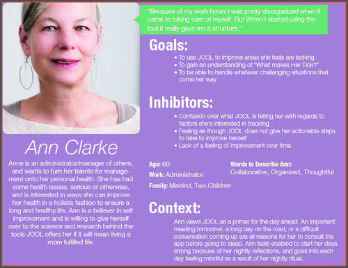
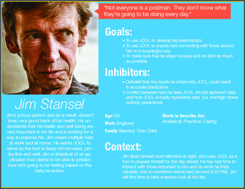
- Personas created from extensive time spent with users for the engineering team to use while they developed moving forward
- An additional set of recommendations culled from hours of user testing, both impromptu and scheduled
JOOL's Need: Understanding of Particular User Issues
When I came to work at JOOL over the summer of 2018, their product had already entered a mature stage in its life cycle and was on the cusp of an imminent re-design for version two of their flagship application. Users across a variety of companies had engaged in their program as a part of their organization’s wellness program. Purposes had been forged, pursued, and attained within JOOL’s system and many people’s lives were all the better for it.
However, leading into this new launch of a revamped version of the JOOL Health app the company was interested in understanding how their users felt about the overall experience. Over the long term they had noticed some fall off of user activity along with some “muscle-memory” when users charted their days over a period of time. As an organization meant to consistently direct users toward their purpose they needed to understand why these phenomena were occuring, and that’s where I came in.
Positioning Myself for Insight
By the time I came to JOOL the main user pattern that they wanted to explore had already been discovered through the distribution of a user survey: after using the application for a period of time some users ceased using the app, or they began exhibiting a muscle memory when telling the app how they were feeling each day (they charted the same levels day in and day out). While the goal of my research was clear from the moment I began my work, I nevertheless began my process by engaging stakeholders at the organization in order to discover more about this main research area of interest and any other significant aspects of JOOL Health that I should be aware of.
Once I knew how people at JOOL felt about my research domain I needed to become extremely knowledgeable about the product itself. With that in mind, I spent a significant amount of time diving deep into the app and exploring every corner of the significant purpose driven application.
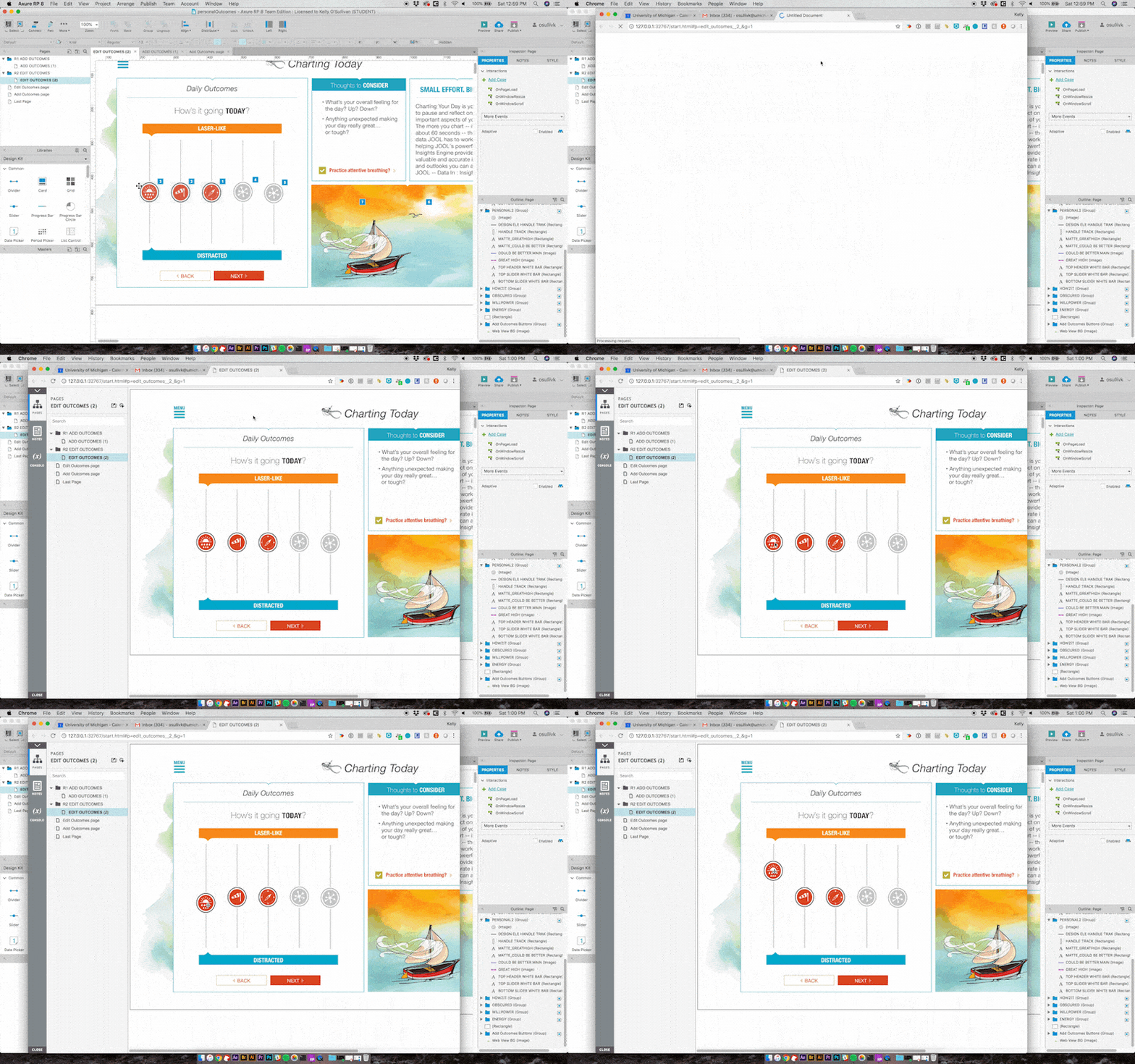
Based on my now considerable knowledge of the inner workings of JOOL I was asked to create prototypes of various areas of interest within the app that my supervisor, Tim, wanted me to examine through user testing. By reason of these areas being mostly concentrated around the onboarding stage of the user journey this was a perfect opportunity for me to seek out new users. I did this at coffee shops, libraries, and parts of the University of Michigan campus and was able to quickly bring back user feelings around some new onboarding features that were being included in JOOL’s forthcoming version two update. I presented my findings to both my supervisor and JOOL’s engineering team and what resulted was some quick changes in advance of the actual launch of version two.
“Kelly’s understanding of mobile and web interface and expertise in user testing was a huge advantage to our mobile and web app production. He put this skillset to work in order to push our product better each time.”
It was at this point in my time at JOOL that my responsibilities branched off into several distinct directions. My supervisor provided me with several needs that I was to address, but largely left it to me to determine the best course of action. I elected to choose user interviewing and continued user testing as my main tools to accomplish the goal of substantially increasing JOOL’s qualitative user data and set to putting both to work simultaneously. While working through a considerable amount of test and interview data I was also asked to create user personas for the engineering team to use moving forward. As the point person speaking with the user base as well as various stakeholders I was well positioned to complete this task as well.
Pulling it All Together
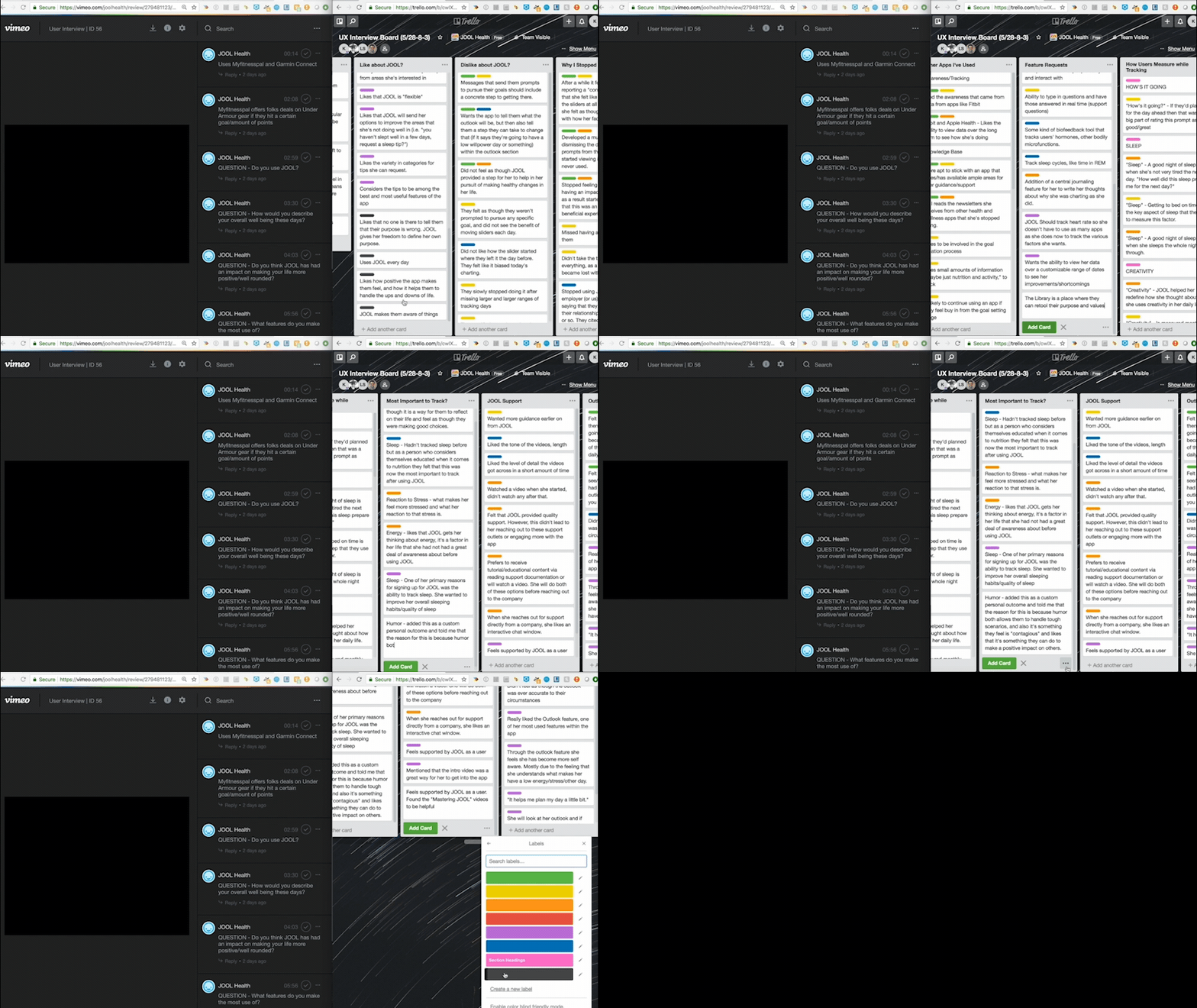
Once I had brought in the user data I was going to use to put together recommendations, I needed to synthesize the data and identify patterns in what JOOL’s users were saying. For my user interviews, I chose affinity diagramming to connect user data across multiple interviews. I created annotated interviews using Vimeo so that all members of the JOOL team could view significant points in the interviews if they wanted to, but also made it easier for those who prefer to read user data by creating a massive affinity wall in Trello of all of my findings from interviews.
For my user tests, I was thankful that I had taken the time to both screen record and videotape over the shoulder of all of my participants. Now I could sync those two video sources up and observe in minute detail every interaction that was made during the tests.
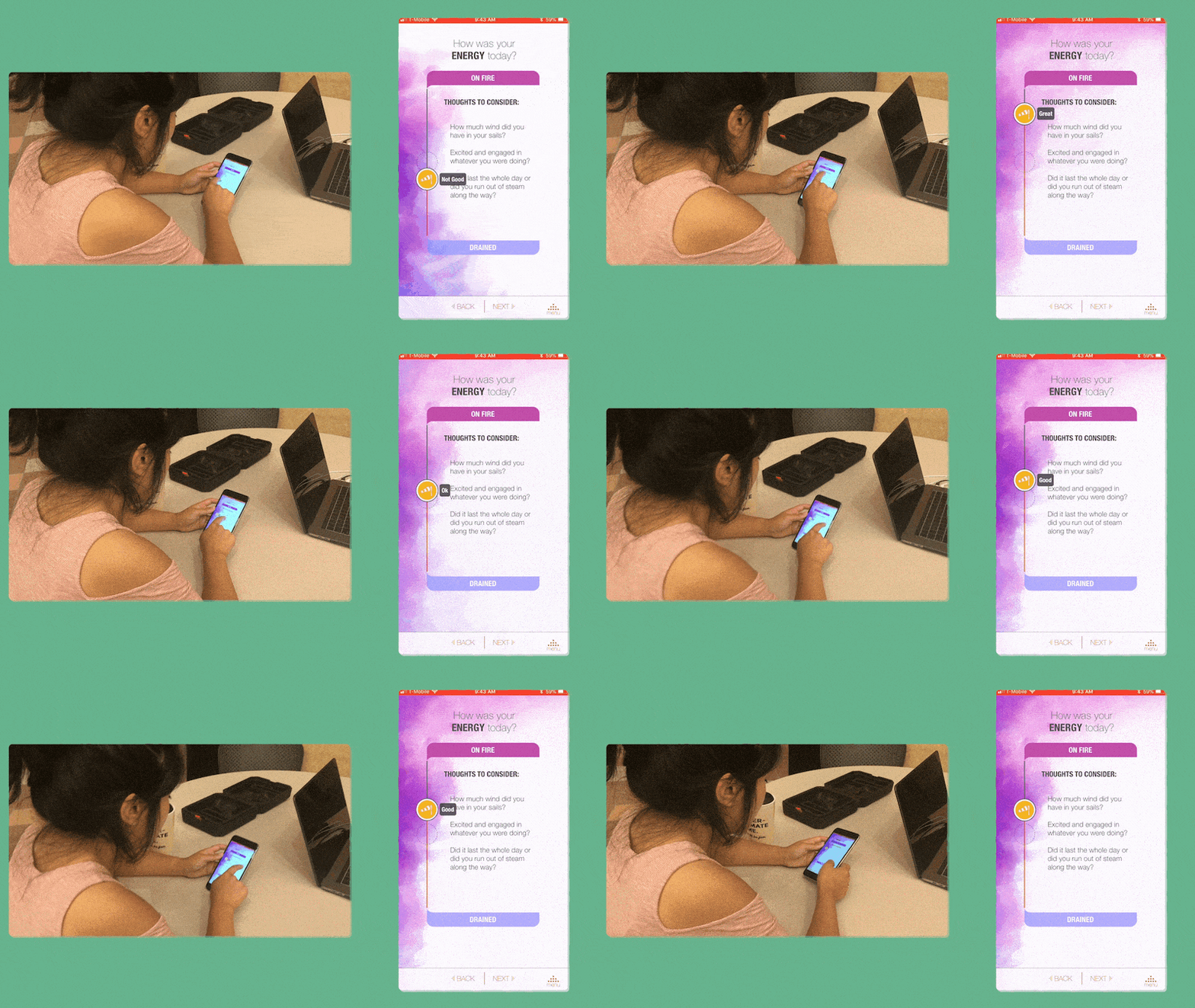
From this method I discovered a number of interesting interaction patterns that would further inform my recommendations to the company leadership. Once dozens of hours of user interviews and tests had been analyzed and coded, I had a set of insights that I had derived from them and was ready to present my findings to the JOOL team.
Presenting my Interpretations
I had the opportunity to present my findings to the entire company and was able to impress upon them the qualitative data I was able to pull from my extensive time getting to know JOOL’s user base. Broadly speaking, users of the JOOL Health app were calling for a number of changes to the app’s experience and it was now up to JOOL to determine the best way to implement their needs.
While my time there was restricted by the length of my internship program, shortly after my departure JOOL released a version three of their application that included in their new designs the essence of the recommendations I made to the company after my research had concluded. Among other aspects of the app, JOOL reduced the number of areas of their lives that users have to focus on improving in order to successfully use the app making for a simpler, more focused experience.
“Kelly’s contributions over the summer helped us push our product forward, encouraged interaction, and fostered continued understanding of our user base.”
Looking Back
Experience and interface design do not exist in a vacuum. Every interview, test, survey or any other tool we make use of has to be designed to work for as many of the teams within a company as possible. Methodologies used to get to the root of a user experience problem are only as strong as the amount of pertinent factors pertaining to the product that they consider in their application. I would be thankful for my opportunity to work with JOOL Health were this the only thing that I took away from the experience. Fortunately there was much, much more. I had the opportunity to work with multiple departments within the organization, which helped me to gain valuable additional perspectives to how a product should develop over time. I was able to present my findings to the entire company and through that was really able to see how different groups interpret and appreciate the findings gathered through user research. I had the opportunity to hone my rapid prototyping skills and learn new programs and their place in future research projects as well as new methods of conducting research. JOOL Health was a great place to continue developing my skills, and in the end it made me hungry for my next challenge.