
Interaction Animations
I’m a fan of fluid, purposeful motion and I believe its addition to websites and apps makes a world of difference. Currently I use Sketch to create mockups in conjunction with AEUX in order to send those designs to After Effects where I animate interaction concepts.
Music Player App: Now Playing to Playlist
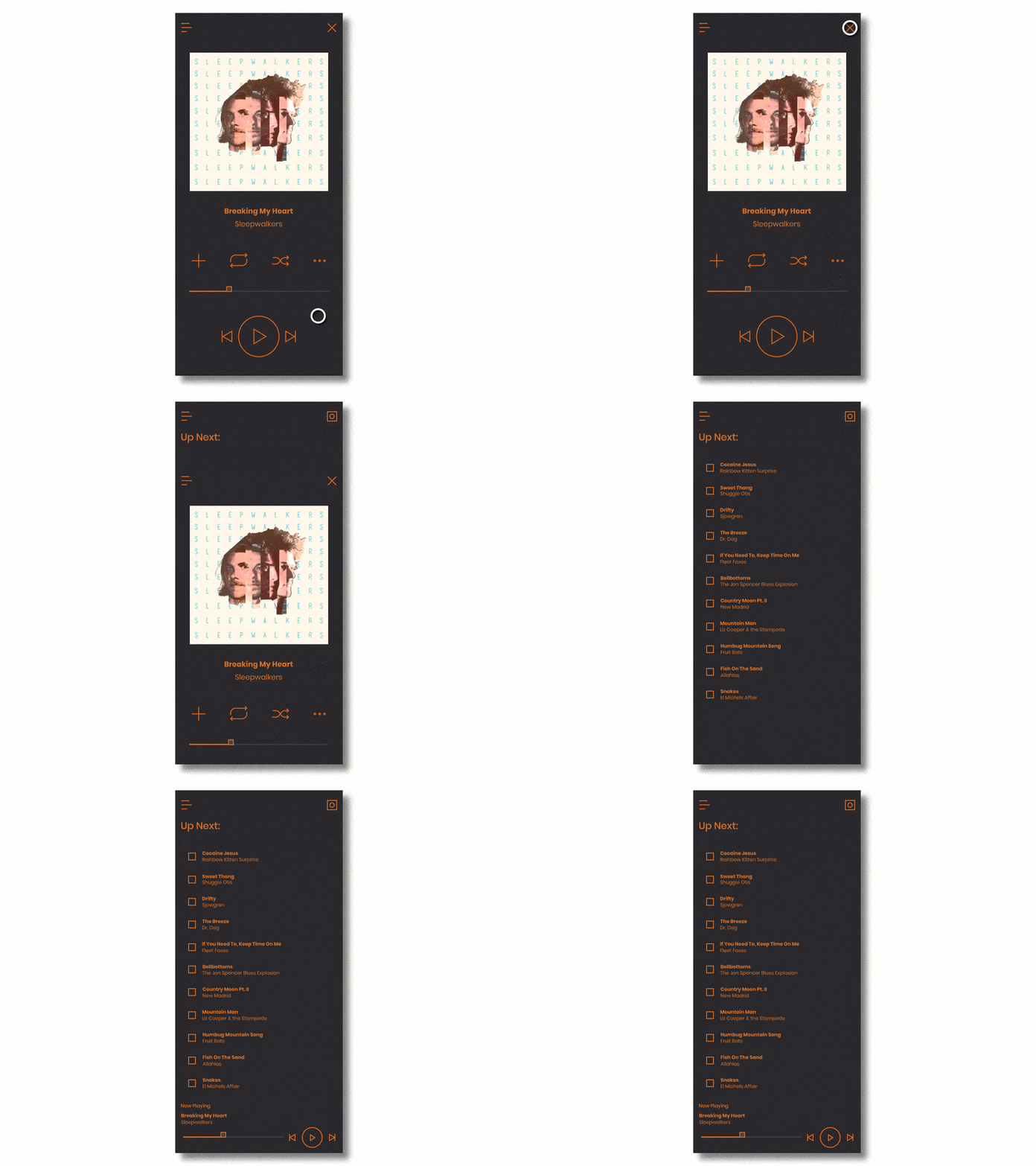
Music is a huge part of my life, and when I think about a music player app that I want to use, I think of one whose interactions are as engaging as the music they’re giving a user access to are. In this case, moving from a “Now Playing” screen to a “Playlist” screen, I’ve added an initial transition animation that quickly eases into a fast downward transition. Once the “Playlist” screen is front and center, the list items appear on screen in an offset opacity/position animation that really emphasizes the “list” nature of this particular area of the application.
Dream Monitoring/Diary App: Explore to Dream Diary
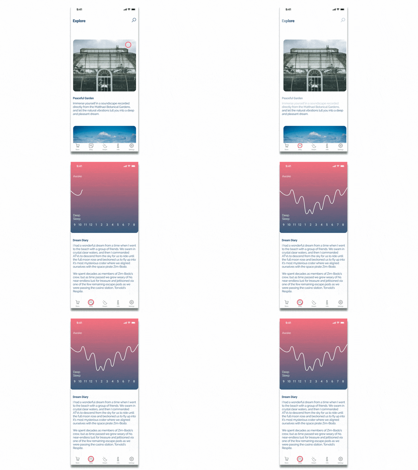
This Dream Monitoring/Diary App design has a lot going on in these two screens. As a result, I felt that the various elements should animate on and off in large sections in order to keep the transition time down. In the Dream Diary animate-on, I had the data visualization animate on first and from a new direction (up-down as opposed to right-left as the did in the Explore menu animate-off) in order to create visual interest in the main information element of this new screen the user is moving to.
Travel App: Carousel Animation, Transition to Main Package Page Animation
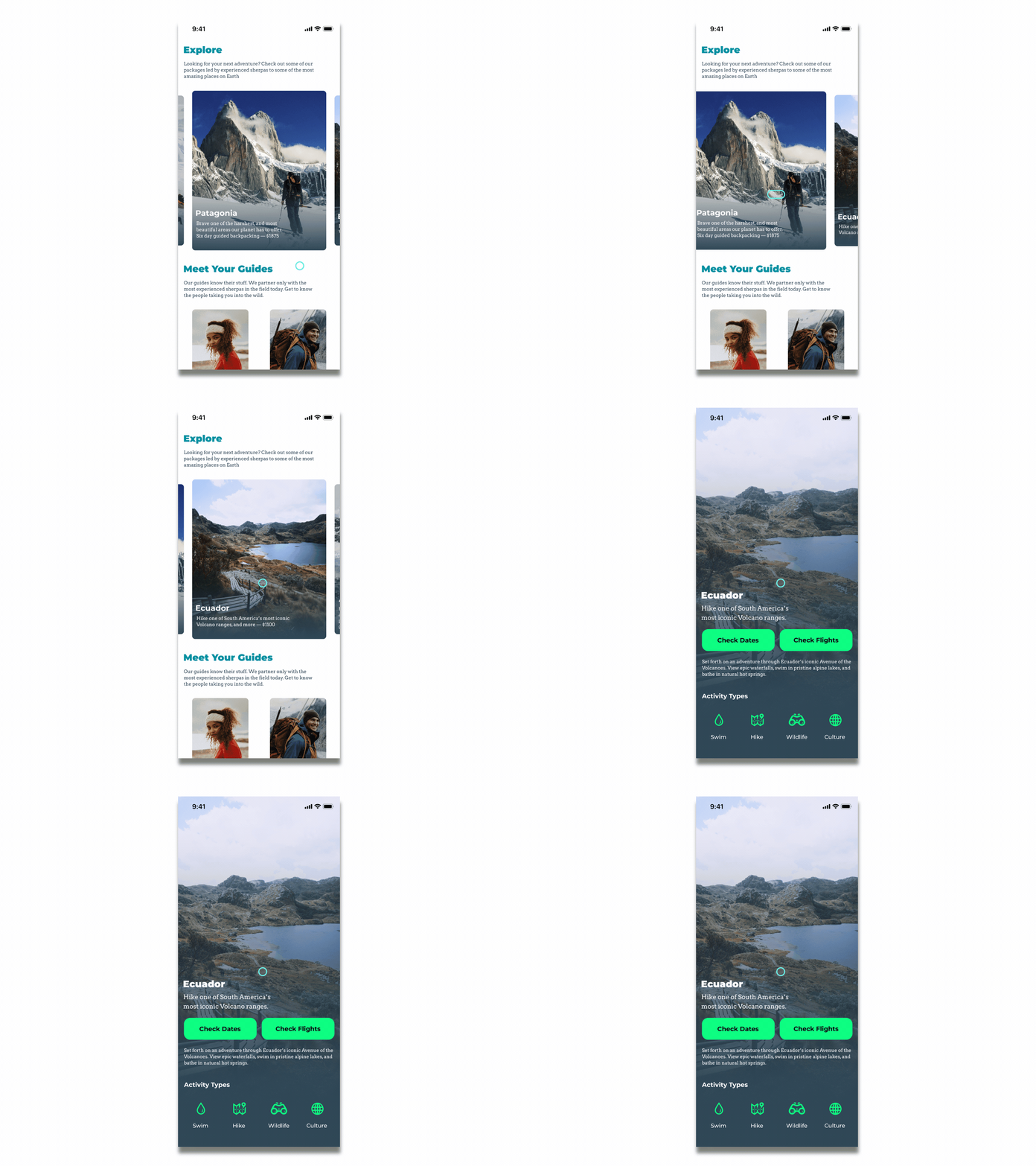
I wanted to work on the basics with these two animations. What I wanted were crisp, purposeful moves that help users navigate the choices available to them while adding in subtle motion cues that give the sense of interacting with actual physically manipulable objects.
Interface Elements
Click the interface elements below to see their animations
